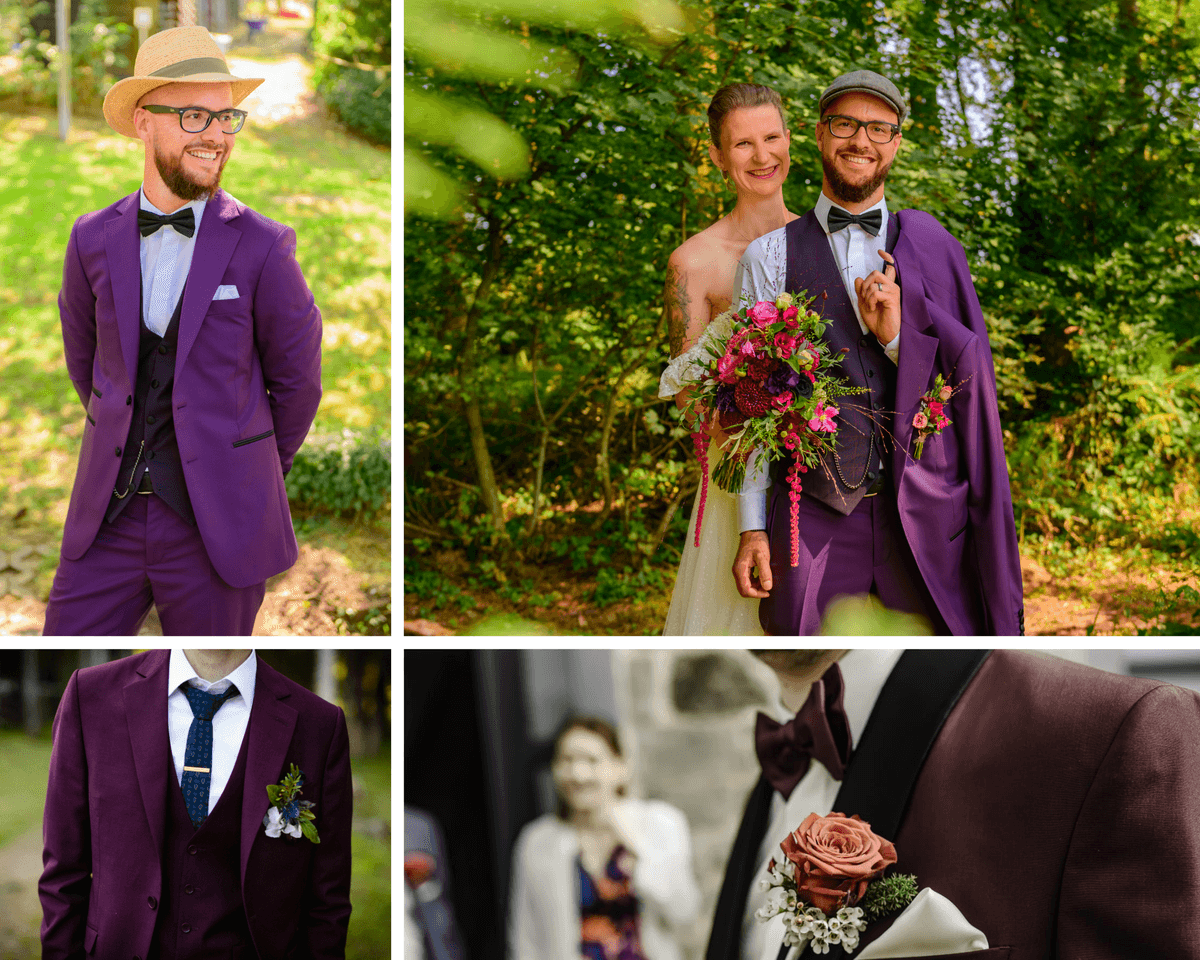
At Ferala Luxembourg, color is never decorative by chance. It is a visual language in its own right: it structures the silhouette, evokes emotion, and asserts intention. Shade, value, and saturation are the three pillars that allow us to create a coherent and expressive suit, capable of reflecting the groom's personality while respecting the aesthetic balance of the wedding day.
Shades, values, and saturation: the invisible balance.
A shade refers to the subtle variations of the same color. It allows us to bring depth and refinement to a suit, highlighting certain lines or harmonizing the whole without ever weighing it down. A blue ranging from glacial to deep, or a pink that transitions from powdery to orchid, creates a discreet yet sophisticated visual richness.
Value, on the other hand, refers to the lightness or darkness of a hue. Light tones lighten the silhouette and convey an impression of freshness and modernity, while dark tones structure the body, anchor the suit, and lend it authority and depth. The interplay between light and dark thus allows for precise shaping of the silhouette.
Finally, saturation determines the intensity of the color. A highly saturated hue immediately catches the eye and asserts a bold style, while a softer color establishes elegance and subtlety. It is this balance that makes all the difference between a spectacular suit and one that is merely garish.
Johannes Itten and the art of contrast applied to tailoring.
The work of Johannes Itten, a major color theorist at the Bauhaus, is based on the idea that harmony arises from controlled contrast. His seven chromatic contrasts, initially conceived for art and design, now find a natural application in bespoke tailoring. They help us understand why some color combinations work instinctively and why others throw the silhouette off balance.
In a suit, for example, the contrast between light and dark helps structure the outfit and refine the lines, such as pairing a bright ice blue with a deeper navy. The warm-cold contrast introduces dynamism and emotional balance by combining sunny hues like gold with cooler colors such as turquoise. Saturation contrast, meanwhile, helps to create a hierarchy among the elements of the suit: a very intense touch draws the eye, while softer backgrounds ensure coherence and elegance.
Thus, the suit becomes a carefully considered visual composition, where each color interacts with the others rather than standing out in isolation.
Saturated and expressive palettes: asserting your personality.
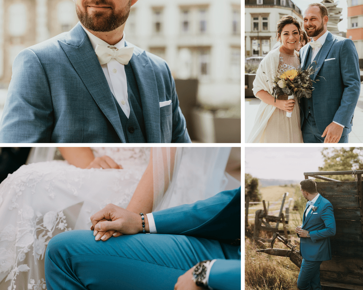
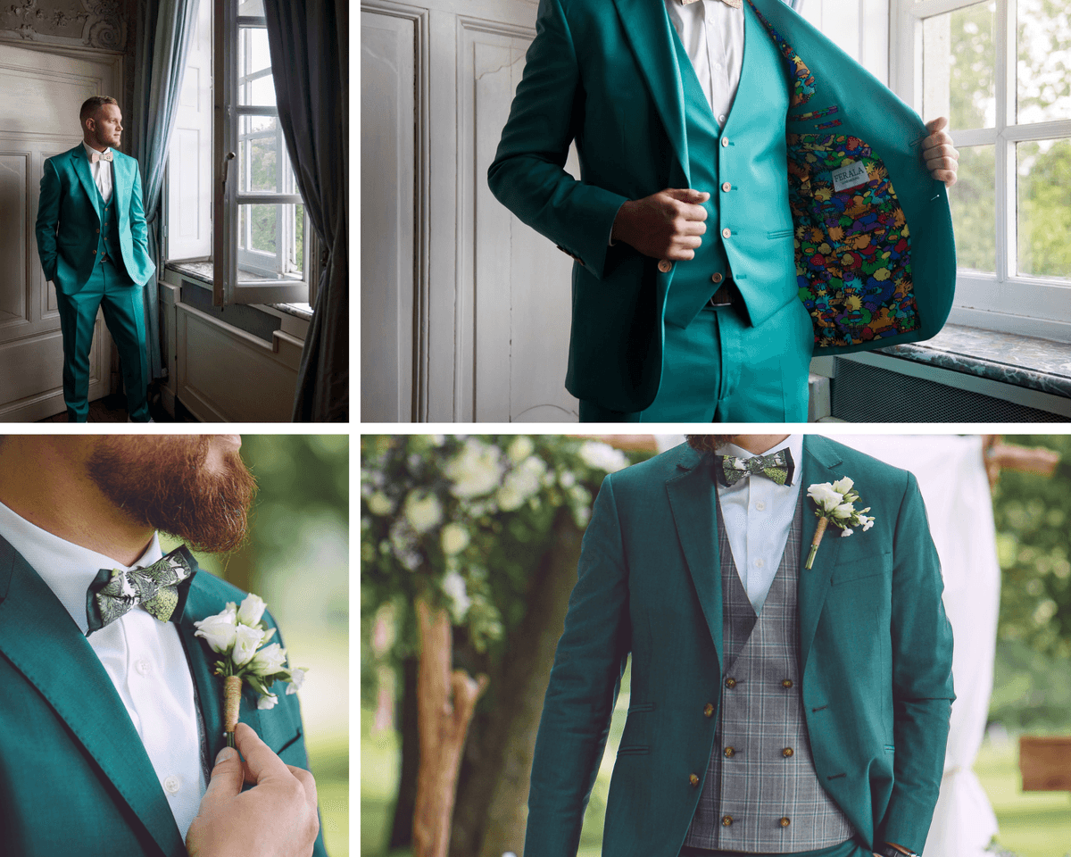
Some palettes fully embrace the power of color. The turquoise and electric blue duo embodies contemporary energy and confident modernity, ideal for a groom who wants a strong and distinctive suit. The combination of gold and canary yellow brings warmth and immediate impact, playing with light to create a striking presence. Fuchsia paired with a deep or solid red is perfect for artistic and contemporary weddings, where boldness becomes a stylistic signature.
These palettes are never excessive when well-balanced: they rely on controlled proportions and a constant interplay between intensity and visual breathing room.
Materials and textures: revealing color.
Color only truly comes alive through the fabric. Superfine wools and cashmere offer a fluid and precise drape, revealing the depth of the hues without stiffness. Linen-wool or cotton-linen blends ensure breathability and lightness, ideal for colorful suits worn all day. Satin or slightly structured textures capture the light, amplify the saturation, and add dimension to the suit, while guaranteeing comfort and elegance from morning till night.
The art of color balance.
The jacket lining is the perfect space to express a bolder color without disrupting the overall balance of the suit. It allows for the introduction of a complementary contrast or a more intense play of saturation, visible only in movement. A deep blue jacket can thus reveal a turquoise or fuchsia lining, creating a controlled surprise. It's a strong, intimate stylistic nod that affirms the groom's personality while maintaining impeccable outward elegance. The shirt, for its part, plays a balancing role. It acts as a visual breathing space between the suit and the face. Light, low-saturation shades - off-white, ivory, very pale blue, or powder pink - help to calm an expressive palette and highlight the suit's features.
The suit's color is unrivaled. In a bolder approach, a slightly tinted shirt can echo a secondary shade of the suit, provided it remains within a soft range to maintain harmony. Accessories are the prime opportunity for contrast and color hierarchy. Ties, bow ties, pocket squares, or boutonnieres can feature a complementary color or play with a higher saturation than the rest of the outfit. A gold pocket square with a turquoise suit, a fuchsia bow tie on a neutral base, or an electric blue tie with a softer ensemble can draw the eye without disrupting the silhouette. Here, the principle of quantity is essential: a strong color must remain in the minority to retain its impact.
Why dare to use color in a bespoke suit?
Choosing a well-considered color palette means creating a unique, cohesive, and meaningful suit. Soft shades convey refinement and composure, while saturated hues assert character and confidence. As with any successful visual identity, the strength of the suit lies in its intention: every color, every contrast, every fiber is designed to interact with the body, the light, and the emotion of the moment. At Ferala Luxembourg, color thus becomes a tool of expression, serving a deeply personal and resolutely elegant wedding suit.
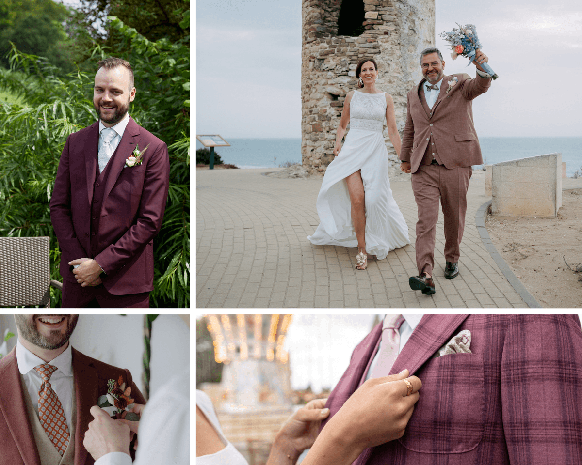
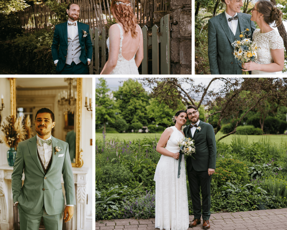
*The photos used come from our clients who have given their consent to their processing.